"BORROWING" WALLS

Steven Holl’s Storefront in New York deals with walls in an interesting way. By employing swiveling panels Holl attempts to merge an often closed artistic community with the public by opening up the gallery onto the street. The panels actually encroach on the pedestrian walkway, thus forcing passersby to engage with the gallery. I find the use of walls as a mechanism for activating public engagement with, and into, the art world to be very interesting, and this concept shows that walls do not have to be structural elements alone.


In thinking further about bringing street art and high art together, I have developed the idea of the ‘borrowing wall’, in which the exterior face of the gallery wall is allowed to be graffitied before swiveling sections of the wall inside, thus temporarily bringing the outside street art inside within an established art domain. I do not think street art should ever remain indoors, but this technique of "borrowing walls" attempts to deal with it.


Proposal

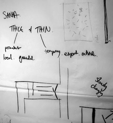
THICK AND THIN

In 2009, Dr Peter Corrigan of RMIT was invited to discuss the question of inviting international or local architects to design public buildings. He argued that the experience of buildings has two readings: that of thin and thick. A 'thin' experience is where an architect has no detailed background knowledge of the history, society and culture that informs the ideas for a design, only what he call "surface information" that is basic data about the site. In contrast , a 'thick' understanding is evident when both architect and audience share the same background and have a common experience they can both relate to and where this shared knowledge is made relevant in the design. In terms of my design, I know the Newtown area fairly well having lived in Sydney all my life. This it is important to be aware that background knowledge is informing my design and the aim is to achieve a design which informs and people who read the building with thick and thin knowledge.

PUBLIC ART

From thinking about the wall in art, I am inspired by the public murals and street art in and around Newtown. If I wanted to design a gallery reminiscent of an alleyway where graffiti could take place. Site 1 would be good as it is long and narrow. However, Site 3 already has an alleyway as a back entrance which could provide and interesting way to enter and exit the gallery.


Local street art

THE WALL IN ART

From previous research into the design of museums I am interested in the role ‘the wall’ plays in display (framing the context for, and the means of, the display of exhibits, art, etc.). In galleries which display ‘high art’, the walls are often simply used as vessels, where they hold art for a period of time before being replaced with another work or where walls are usd to define discrete areas or rooms (and thus guide and direct the experience of art patrons). In ‘low art’, the wall often becomes part of the art, for example, graffiti is layered over each other continuously onto the same wall. In this way the wall becomes a crucial component of the art experience, and is an ephermeral record . It would be interesting to explore the role of the wall in the display of art, and perhaps develop a number of ways that a wall can merge high art and low art.

Thus, my current narrative is: A meeting point for discussion of high art and low art.


MUSEUMS

Before launching into design ideas I studied a number of museums to try to understand what it is that ‘makes’ an art gallery. They all varied in style, depending upon the location and type of art intended to be displayed. What I did find interesting was the often subdued nature of the architecture, which only passively supports the artworks. It occurs to me that if a gallery has a specific theme it would be exciting if the architecture could take a more active role in providing an exhibition space that enhances the artistic experience. Below are some images of Steven Holl's museums. I particularly like his use of large expanses of white walls and lighting.


SITE 3

Newtown is a vibrant inner city suburb of Sydney with a history of fostering an eccentric artistic community.  There is easy access into the Sydney central business district for workers, and as the suburb is adjacent to a large metropolitan university there is a large residential academic community (students and staff). It is a cultural centre for alternative music, fashion, food and art. A number of large murals are located in the area, often based on a particular political viewpoint and conveying a political message.


The majority of buildings along King Street are commercial, with a large number of restaurants, shops and bars. Typical building heights along King Street range from two stories up to four with awnings over the pedestrian walkways and continuous store frontages. Sunlight, therefore, is an issue as much can be blocked by the surrounding buildings.


King Street is a major transport thoroughfare to southern Sydney and is well serviced by public transport. Parking is an issue for surrounding streets and the traffic load along King Street is constantly high thoughout the day and for much of the night. Newtown is a major nightspot destination, drawing visitors and local residents alike.


As with all cities, there is the issue of vandalism and security, however the graffiti, poster advertising and public street art all add to the vibrancy and character of the area.


 Sydney Climate Data:

For further details click here


Site 3: Shadow Analysis:

Summer


Winter


FINAL DESIGN

 
Site Plan

Floor Plans

Longitudinal Section

Cross Sections

Axonometric

Rendering

Eroded Hugh Ferriss Building


Her Mural Wall

His Room Lighted

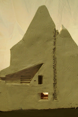
Model Scale: 1:200

The final design is the result of many ideas which developed slowly over time. Based on the narrative and parti, there are three elements, his space, her space and the void. Both people are attempting to focus their attention away from each other and engage in their own pursuits. This ignorance of one another has had a destructive effect on their relationship, producing the void, an echo of a chimney. The void is an empty space which separates the two people physically; however, it is also the connection of the senses hearing, smell, taste and touch.

Her space is studio focused towards the East, towards the Museum of Modern Art, her artistic inspiration. She has a “mural wall” which she layers in paint and allows her to express herself. The surface is lit from above by a heavenly window diffusing soft Northern light down the wall. This space is bright and airy, optimistic over her newly found artistic opportunities.

His space in contrast is directed South at the Financial District and Wall Street. The downward pointed window only lets in artificial street light and the final glow of the setting sun in the West by the alcove. Low ceilings and slit windows increase a feeling of oppression. There is a single desk to work at and cramped seat set into the alcove, but other than that the room is a dark, bare, lonely room.

There is a dumbwaiter which connects the rooms by the void, which could allow communication if they wish. I have done this to suggest the possibility the relationship could improve in the future. We know the Great Depression ends, and perhaps they will reunite.