PARTI

 
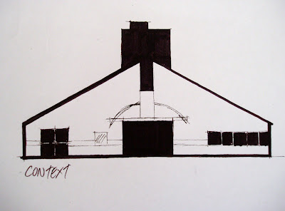
Architecture begins with an idea. An idea being a specific mental structure by which we organise, understand, and give meaning to a building. A parti is this central idea or concept of the building. It is a derivative of a French verb for departure. In other words, a parti is the beginning.

Parti are derived from understandings that are non-architectural, often expressed by a diagram depicting the organisational floor plan and by implication, the sensual experience.

Diagrams can describe massing, spatial hierarchy, site relationship, core location, lighting conditions, entrance, interior circulation, public/private zoning, geometry, program, structure and enclosure.


 It took me a long time to develop my parti, as I initially had many ideas I was trying to include. By conducting research into the house, the context and the architect I was able to finally simplify my concept and gain a clearer understanding of the house.

POCHE

 
“Architecture is the thoughtful making of space” – Louis Kahn.

Positive space has shape and negative space does not. However through the arrangement of positive spaces, negative space can be transformed to create a positive space.

We travel through negative spaces and dwell in positive spaces. Negative space promotes movement whilst positive spaces create place. Suburban buildings are typically freestanding objects in negative space.

We inhabit the interior spaces shaped by walls, roofs, floors, stairs and chimneys.

A floor plan demonstrates the organisational logic of a building (parti) where as a section  showing the interior space embodies the emotional experience (poche).


MODEL


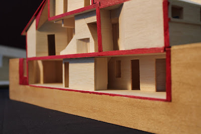
The following are images of our group model. We stained the base to show how the house is sunken into the ground with the lower basement. The colour red was used where the section has been cut and highlights the building's structure in much the same way a poche would.


MODEL MAKING

This has been an interesting course as it encouraged me to think beyond the usual 2D representations of ideas into a spatial experience. We were required to read a number of extracts from design theorists and extend our interpretation of their ideas into a 3D model. 'The Fold' by Gilles Deleuze resonated with me the most, as I am interested in the idea that our world is not made up of separate parts but rather one, connected form continuously folding and unfolding in different directions.

The first model is based on the idea of multiple folds making up a whole. It would have been better to create it all out of one piece of card, but I am pleased with the overall effect. I felt it was important to include the A3 base in the model so there is interplay between the positive and negative space and use of light and shadows.


For the second model we were required to explore a part of Sydney's CBD and develop a response to our experience, through a 2D collage, text and ultimately model. My main reaction was the sense of layering and revealing and concealing of views as I walked down Hunter Street. My chosen found material was semi-opaque plastic containers which lent themselves to the notion of layering and gradual concealment. I cut into the base to try and emulate the sense of perspective I felt when looking up at the buildings, and the labyrinth the streets produce. I could have incorporated the textured playdoh more and this was the weakness of the scheme.


The third and final model was an investigation into the use of balsa wood as a modelling material. We were required to investigate and test a number of joinery techniques and means of using balsa in innovative ways.
My chosen word was 'Peace' and from that I looked into the definition of peace both texturally and through imagery. I decided to use the Ying-Yang as my representation of 'Peace' as to me it meant disparate parts joined together in harmony to create a whole. This related well both to my understanding of the 'The Fold' and to the joinery techniques of balsa, and this became a central theme to my model. I treated my poster as a record of this thought process and a reflection on my understanding.
My model was designed to celebrate timber joinery and the production of a whole from multiple pieces. I deliberately set myself the challenge of not using any glue, only joinery techniques to hole the whole model together. I wanted the base to reflect back the arch, as a mirror would, in the theme of the 'Ying-Yang', positive to negative. This final model was a good review to my journey of the workshop, as it incorporated all that I had learnt from the past weeks. I very much enjoyed the chance to express my design ideas in a spatial sense.


FLUID THOUGHTS TO ACTION


In this workshop I developed my freehand drawing and painting skills using charcoal and ink. Using creative methods we were encouraged to use the materials to express alternative perspectives and ways of exploring spatial environments.

We started slowly, using charcoal to depict objects from different vantage points and the way motion can be suggested in a 2D composition. The next week we learnt how to stretch watercolour paper and use ink in a variety of methods. This was a real learning experience for me as I am not familiar with the medium and struggled initially controlling the ink. Through practice and homework a home I began to understand how to use the ink effectively.

We then had a field trip to the Museum of Sydney, and completed a number of sketches with charcoal and ink. Using these as inspiration I produced a final work which was designed to incorporate all the skills I had practiced in the past weeks of the workshop. It incorporates movement, through the change of one position around one of the rectangular pillars in the forecourt, and has an ink base and charcoal layer over the top to enhance contrast and fluidity of the superimposed images.


This is the work of which I am most proud as it is a good resolution to my experience of the workshop. I will definitely be able to use the skills from this workshop in future.

THE ANIMATION


This is the final product. It is a short animation on the process of observation and sketching. The viewer first notices the shape of the object, in this case the Red Centre, and then as the time continues the viewer can focus on the detailing and minor features which add to the overall recognisable image of the Red Centre. Then, a changing of perspective takes place, as the viewer begins to appreciate the bigger picture and context of the object, and so the process of shape to detail continues.

PROCESS

Due to the nature of the storyline, a building up of detail, it made sense to try and use the same drawing continually captured to create the majority of the animation. To do this, I drew an outline of the finished sketch, and then through tracing I would add a line, photocopy the page, add another line, photocopy the page, etc. This way I had hard copy versions of the sketch as I drew it. For the shifting perspectives I could not use this method, but I found it none the less enjoyably challenging. Before scanning and adding the drawings into iMovie, I had a total of 80 slides. The actual sequencing of the slides into a movie was the simplest part of the project.


STORYBOARD


My process of creating the storyboard for my animation was to first decide on a begining, middle and end slide. Then, I would continually divide the slides into five, ten, twenty and eventually forty thumbnail sketches of what I roughly plan on drawing. To allow the animation to flow smoothly I will need more than forty, but these are just basics to get me to plan what I will draw.


Currently, the storyline is that an observer who will be sketching the outside of the Red Centre, first thinking of its shape and gradually adding detail. I would like to play with the idea of losing the gained detail, perhaps through loss of light or shifting of perspective and/or distance.


SHAPE TO DETAIL

Brief: There is a process of observation when sketching an object, be it animate or inanimate. First, note the overall shape and obvious features of the object, and then, as time permits, focus on individual detail. The build up of detail is what in the end allows the sketch to be recognisable. An experimentaion of this process will be the aim of the animation.


FINAL MODEL


Below is a link to my final Unreal Ed model:


Final design.

The structured pathway through the design is a simple circuit. To neutralise the meeting space I have designed the elevators to work such that Prada must go up to meet Obama in his office, so that they can both enter the meeting space together. Once lunch is over, Obama must accompany Prada back to her work space, before continuing back up to his office. This creates a connection between the two clients that extends beyond simply having lunch together.


Obama's entrance hall. Intimidating initially, until the columns react to the client's presence and sink creating openings to the outside.

See: ftp://emustore.fbe.unsw.edu.au/resources/samples/Arch/ARCH1101%20-%20Lowe/Lecture_Nine_Action_Interaction_Reaction/prison.mpg


Elevator up to Obama's office; the building responds to the client, enhancing a feeling of power.


Obama's office, classically simple yet warm; different to the intimidating entrance hall before.


The meeting space and dining table for Obama and Prada to share their lunch in a neutral environment.


The meeting space. The dining table and chairs rise back up as Prada and Obama leave.


Prada's building is constantly pumping, working hard to maintain the status and power of the "Prada" label.


Prada's production gallery.


Elevator from Prada's space back up to Obama's space.


Elevator animation