TEXTURES

These are my 36 custom textures. When thinking of the words I used, I tried to explore unconventional ways of describing materials. I did find it difficult trying to express such complex ideas and feelings into a 2D drawing.


 I used "pattern" in my model on the lower stairs. The reason I chose this texture, is because I imagined the material I would need to use for those stairs would have to be strong. The stairs cantilever out from a side support which is either hanging from the ceiling or held up from the ground. The balustrade is also only supported at the lower end. Thus it is important the material I choose to use does not bend or break when placed under the forces. I would need to use a strong material, such as carbon fibre, which could support its own weight and that of the users. This custom texture I feel represents the strong binding within the material.


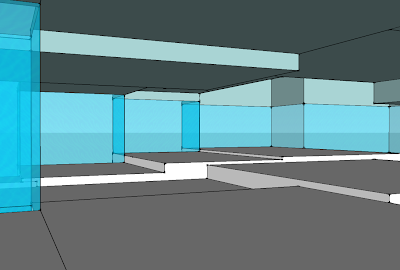
This is a screen shot of the texture used on the lower stairs. The detailing of the pattern in the texture attempts to represent the strength and reliability of the material used for the stairs.

WALK-THROUGHS

Throughout the construction of my models I have been using Scenes to help me move easily and quickly from common views that I have been working from. I discovered that the program will link the scenes to form a movie-like animation or walk-through of my models. Although these are not the animations I need to include I thought it might be helpful to keep them on my blog as a record of where I was up to in each of my models before I picked the one to develop further.


Walk-through for Project 1


Walk-through for Project 2

STAIRS

Below are sections of the four stairs from my two draft projects. With the stairs I have attempted to balance form and function. The stairs must above all work on a practical level as well as fit in with the themes of its setting.


Project 1 - Stair 1:


Project 1 - Stair 2:

 
Project 2 - Stair 3:

 
Project 2 - Stair 4:

MOFFATT & GASCOIGNE


I have chosen Tracey Moffatt and Rosalie Gascoigne as my two clients that I will design the studio spaces for. They both have very different artistic practices, which I think will be interesting to try and combine the two into one building. Below is a brief summary of each artist's methods and inspiration, which will help inform my design.


Tracey Moffatt primarily works in the mediums of photography and film; through which she experiments with her chosen subject matter to manipulate the audience to experience her artworks in certain ways.

Her photography and film can range from the theatrical and unrealistic, to the disconcertingly too realistic, depending upon the message she is attempting to communicate. For example, The Movie Star (1985) has an unrealistic and satirical feeling to it; the colours are bright and the composition too perfect, so that the viewer feels like the scene has been staged for the purpose, in this case, of social commentary.
This obvious staging is typical of Moffatt and it can be seen in her films such as Night Cries: A Rural Tragedy (1989), where she has used a narrative scenario shot on an indoor set. This particular film uses manufactured sound to enhance its unrealistic qualities, and create a disparity between the audience and the performance. Moffatt's films continue to play with the relationship the audience has to her artworks in her film Heaven (1997). Through the use a hand-held video camera, Moffatt deliberately manipulates the viewer to feel voyeuristic, as she invasively films surfers at the beach getting changed. The ‘candid camera’ style of footage creates an almost too realistic feeling for the audience, as they know they are viewing something they shouldn't.

This time, rather than creating disparity, Moffatt over involves the audience in her subject matter through her artistic practice.


Stills from Heaven, 1997.


Rosalie Gascoigne is well known for her artistic practice of carefully assembled collections of found materials. She started her artistic career with traditional flower arranging, but later progressed to the stricter Japanese art form Ikebana. From there she began experimenting with arranging scavenged materials such as scrap iron to wooden boxes. As she became more adventurous, Gascoigne moved onto wire, feathers, and what she is most well-known for, yellow reflective road signs.

Gascoigne says that the materials she picks for her art "need to have been open to the weather.". Once she has gathered her materials and she will often store them until she finds a particular use for them. Patiently, she will then place her materials on the floor and will continue to experiment with the composition until she has found the arrangement she is looking for.

Her artworks are open to interpretation, and can often exhibit signs of patterning or else depictions of landscapes, but Gascoigne prefers to leave it up to the viewer to decide.


Wheat Belt, 1989. Sawn/split soft drink crates on plywood. 94 × 277cm.

P.1. SHOTS & SECTIONS


The following images are shots taken from my SketchUp model.


Project 2: Upper studio: "Collection" (Gascoigne) and Lower Studio: "Voyeuristic" (Moffatt)

 
Section showing the three levels and upper stairs


Upper studio


Gallery (looking into Moffatt's studio)


Lower studio


Section showing the plan of the lower studio.
The word "Voyeuristic" is demonstrated both by being watched and by being the watcher.


P.1. SECTION SKETCHES

I began to explore the idea of spherical spaces, before coming to the idea below of a house-like structure being pierced into the side of the sphere. I was thinking about the Louvre in Paris, and its inverted glass pyramid; which then inspired me to try to link that famous art gallery with the one I was designing. It was Erwin Wurm's sculptural artwork "House Attack" which inspired the idea of an entire house being discarded.


Erwin Wurm. House Attack, 2006.
Outdoor sculpture at the Museum Moderner Kunst (MuMoK) in Vienna.


Below are some sections of stairs. I used existing stairs I liked from the lecture and practiced drawing sections of them. This was helpful for when it came to drawing my own stairs.


Below are my the 18 sketches of sections relating to the words I first picked. Later, due to the advice from my tutor I used different words because my initial words did not provide me with enough substance to create more interesting spaces. However, the models I ultimately used developed from these first drawings. This was a good exercise to practice my line work.


P.1. NOUN, VERB, ADJECTIVE


The following images are selected artworks by our three client's, Fiona Hall, Tracey Moffatt and Rosalie Gascoigne. We must decribe each work with a noun, verb and adjective. These words will then be used as inspiration for our intial concept sketches.


Nelumbo nucifera; nelum (Sinhala); thamareri (Tamil); lotus, 1999. Aluminium & steel

Fiona Hall: reflective, growing, fertility.


The Movie Star: David Gulpillil on Bondi Beach, 1985. type c colour photograph. 48 × 72cm

Tracey Moffatt: performer, viewing, voyeuristic.


Metropolis, 1999. retro reflective roadsign on wood. 232 × 319.5cm

Rosalie Gascoigne: patterns, discarded, collection.


EXP.1. THREE THINGS

1. My best piece of creative work:


This is a painting from my HSC Visual Arts Major Work which was based on my family and their cultural identity. The two sides of my family are juxtaposed in one being from the country and whom are what society views as being the typical Australian bloke; where as the other side live in the affluent suburbs of Sydney and are proud of their English heritage. I appropriated artworks from influential Australian artists William Dobell, Russell Drysdale, Noel Counihan and Margaret Olley to create individual portraits of each member of my family in a way that I feel best represents their personality and cultural identity. This was the final painting of the body of work and it involves me with my father and uncle, the two differing side of the family, in deep discussion and debate. The composition is based on a Noel Counihan painting which is of three “blokey” men enjoying a beer at the pub and the background is appropriated from a Margaret Olley interior. The painting attempts to summarise the collection and offer my point of view on the family and in turn my perceived cultural identity.


2. Architecture I admire:


A piece of architecture that I really admire and enjoy is the Sagrada Familia in Barcelona, Spain. The church designed by Antoni Gaudi is still under construction and still far from being finished. Gaudi began the project in 1882 but following his accidental death in 1926 work was basically halted until being resumed in 1954. Last year I travelled to Spain and was able to experience the Sagrada Familia first hand. I was in complete awe of the tall and mind bogglingly detailed stone structure; which with its elements of art nouveau make it seem alive and growing like a kind of plant. I remember thinking that no wonder it is taking so many years to finish, as no part of it is left untouched by some sort of feature or detailed design. It’s the craziest building I have ever seen and I would love to go back and see it once it is complete.


3. An original photograph of something beautiful:


I took this photo in Switzerland, which I think has to be one of the most beautiful places on Earth. I was on a Topdeck tour around Europe last year and we were travelling on the bus though the Swiss mountains to France, when we suddenly saw this amazing view! I don't even know where it is exactly or the name of the place; we just happened to briefly pass by it – I was lucky to get the photo! But there is something really beautiful about the combination of mountains and lakes, which is why I love this photo.