FINAL DESIGN

 
Site Plan

Floor Plans

Longitudinal Section

Cross Sections

Axonometric

Rendering

Eroded Hugh Ferriss Building


Her Mural Wall

His Room Lighted

Model Scale: 1:200

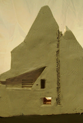
The final design is the result of many ideas which developed slowly over time. Based on the narrative and parti, there are three elements, his space, her space and the void. Both people are attempting to focus their attention away from each other and engage in their own pursuits. This ignorance of one another has had a destructive effect on their relationship, producing the void, an echo of a chimney. The void is an empty space which separates the two people physically; however, it is also the connection of the senses hearing, smell, taste and touch.

Her space is studio focused towards the East, towards the Museum of Modern Art, her artistic inspiration. She has a “mural wall” which she layers in paint and allows her to express herself. The surface is lit from above by a heavenly window diffusing soft Northern light down the wall. This space is bright and airy, optimistic over her newly found artistic opportunities.

His space in contrast is directed South at the Financial District and Wall Street. The downward pointed window only lets in artificial street light and the final glow of the setting sun in the West by the alcove. Low ceilings and slit windows increase a feeling of oppression. There is a single desk to work at and cramped seat set into the alcove, but other than that the room is a dark, bare, lonely room.

There is a dumbwaiter which connects the rooms by the void, which could allow communication if they wish. I have done this to suggest the possibility the relationship could improve in the future. We know the Great Depression ends, and perhaps they will reunite.

FINAL NARRATIVE

The void is the only common thread of their relationship.

ARCHITECTURE OF THE SENSES: JUHANI PALLASMA


From the Renaissance times the human senses, vision, hearing, smell, taste and touch were ordered into a hierarchical system.

Vision was seen as the primary sense, and the one we rely most upon. It is an individualised sense and often the one we redirect first when we focus our attention upon something. In A Room in New York both people have directed their eyes away from each other and onto their chosen activity. With my designed spaces it is important that they do not see each other.

Hearing, however, is different as it connects individuals in a shared experience. It is also possible to read a space by hearing how sounds echo around it. “We stroke the edges of space with our ears”. In my design I could use the echo produced by the void to transmit sounds of the other person to the rooms, so that even though they cannot physically see each other, they are still aware of their presence.

“A particular smell may make us secretly re-entre a space that has been completely erased from the retinal memory.” I could use the sense of smell and taste, perhaps the burnt odour from the chimney, to constantly remind the couple of the void and what once was. It is also possible scents such as the woman’s perfume could drift down to the man, another way they are connected beyond the primary sense.

Lastly, touch and skin sensations such as temperature can affected the emotion of a space. Warmth is often attributed to a feeling comfort and intimacy, whereas cold is the opposite. My design has a destroyed fireplace and both rooms would be cold as result, further reinforcing the idea of the ruined relationship.


By manipulating the senses the design has a much more profound experience. As the primary sense, vision is reduced and redirected, the more archaic senses take over, still providing a connection and awareness of the other.

PARALLAX: LIGHT STUDIES


In Steven Holl’s book Parallax, he conducts a series of experiments with light, the shape of a window and the surface the lights falls onto. Depending on the opening, a number of different effects can be achieved. I particularly thought the half oval skylight was interesting as it diffused the light down the wall. I need to think about my openings, and how the different windows I choose will affect the atmosphere of the spaces.


BETON BRUT: BRUDER KLAUS CHAPEL

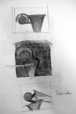
Peter Zumthor’s Bruder Klaus Chapel is a small concrete chapel built by local farmers in a field in Wachendorf, southern Germany. It was cast in concrete around a cluster of 120 tree trunks, cut from a local forest, which were then slowly smoked away. This is a form of béton brut, wood imprinted concrete, but it leaves you with a much greater sense of what was once there. The funnel shape with an oculus that provides the only light for the small dark space reminds me of a chimney, which relates back to my idea of a destroyed fireplace. I would like to use this idea of burning away to create an empty space for my void.

I would also like to use conventional béton brut for my interior rooms, as there is a false sense of warmth attributed to the use of timber, which is only a surface finish. The space would still be cold and hard, but like the couple, you could ignore it and pretend it is not really concrete.
 

CONCEPT DEVELOPMENT: THREAD OF CONNECTION

We are both aware that it is gone, but it is easier to just ignore it.

The idea of ignoring is that it is an active action. To ignore someone there is the need to still be aware of it, thus there cannot be disconnection, otherwise this would be separation. My first parti’s had separated spaces, but with my current one they are connected. The couple in the painting are not divorced from one another, only disconnected in their attention.

In my last project, the Mother’s House by Robert Venturi, the house was held together by a fireplace, which is symbol of warmth and community. Perhaps the connecting feature of this current project could be a destroyed fireplace, a void that is cold and empty, which separates yet still tentatively connects. It is something I shall explore further.

Test Model

HUGH FERRISS


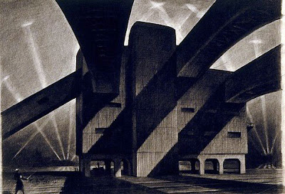
Hugh Ferriss a contemporary of Edward Hopper was an American delineator and architect. Like Hopper, Ferriss worked as a contracted illustrator throughout the 1920’s. Later, he began to develop a particular style, frequently presenting buildings at night lit up by spotlights. The shadows cast by and on the building produces a moody and fearsome atmosphere. His renders appear to glorify the colossal man-made structures of New York City, however the ominous feelings suggests otherwise. My reading of his works is that he, like Hopper, also comments on the value of the modern urban landscape.
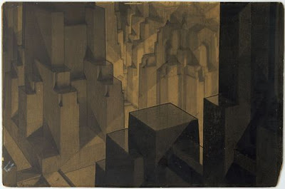
I would like to site my spaces in a Hugh Ferriss building, one that has eroded away and is no longer a glamorous modern building. This deterioration reflects the hardships endured by society at the time as well as the couple’s relationship. If it is just the exterior that is wearing down, perhaps that makes it easier for the couple to ignore.

DEVELOPED NARRATIVE: IGNORANCE

My initial reading of the painting was that the couple are deliberately ignoring each other. However, as I continued my research in the context of the painting my understanding changed, and I read the painting as a couple living in Upper Westside Manhattan 1932 whose relationship is suffering as a result of the challenges of their time.

The man works in the Financial District and is constantly worried and stressed after the Wall Street Crash three years earlier. However his wife, inspired by the Federal Art Project, is busy exploring her own artistic endeavours. His world is a disaster whilst hers is full of opportunity. They are both too wrapped up in their own circumstances to see that their relationship is in decline.

The Great Depression

Jackson Pollock

CONTEXT

Manhattan 1931

New York in the early 20th century was suffering from the Great Depression, but also celebrating an artistic revolution. This revolution arose from the economic depression as the American government commissioned a number of artists to complete public artworks to support local artistic activity and provide encouragement to the community. The Federal Art Project (FAP) supported iconic artists such as Jackson Pollock and Willem de Kooning before their work could earn them income.

The Museum of Modern Art, located in Midtown Manhattan exhibited a number of the FAP works. It opened nine days after the Wall Street Crash, and helped play a major role in developing and collecting the modern art produced at the time. Incidentally, it was also the museum which held Hopper’s first large-scale exhibition in 1933.

Federal Art Project

INITIAL NARRATIVE: SILENT SUFFERING

The discordant notes are suspended in the air only momentarily before the silence presses in again. No reaction.

A bitter gust intrudes through the window from the Atlantic, causing me to shiver. I want to close the blind but I cannot bring myself. The total confinement would be too much. I would come face to face with temptation. It always lurks there in the back of my mind. It would be very simple, my hand enclosing the knob, and my body meeting the weight of the door. The strings would be cut, I would be liberated. I could leave this playhouse.

But for what? Where would I go? How would I live?

The outside world is dark, and I know that there is nothing quite so shaming as a marriage that has failed. Three years, and mine already a failure. All the things people would say. We did not get on. We were not suited to one another. I was too young, too inexperienced, not of his world. The fact I love him in a sad, desperate way, like a child or dog, does not matter. He does not belong to me, but rather I to him.

I don’t stay for his sake, no only for my own pride. I would be content to live in one corner and he in the other so long as the outside world should never know. If he had no more tenderness for me, never spoke to me except on matters of necessity, I believe I could bear it if I were certain that nobody knew of this but our own two selves.


From this narrative I wrote down a couple of points and these became themes that I explored further in a number of sketches.


- Looking outside in – impossible view. Peeking. Voyeuristic. This view is only possible because it is night and the interior is lit up. They cannot see outside. A keyhole is a window in a door.

- Outside (real) life is never quite what is appears from the lofty heavenly window. Down on the streets. Similar to marriage.

- They ignore the outside and each other.

- Divided. Separation. Isolation; but not alone. Self focus. Confined; in the room and in an unhappy marriage.

- Secret truth. Lies. Keeping up appearances. Façade. Stage. Could this be going on in every household?

- Private snapshot. Orchestrated by the artist

A ROOM IN NEW YORK


A Room in New York (1932) by Edward Hopper is of a couple that appears to be alienated and uncommunicative towards one another, as he reads a newspaper and she idles by the piano. In analysing the meaning behind the painting Hopper is quoted as saying, “The whole answer is there on the canvas.”

Hopper’s paintings often have strong geometrical designs, with figures placed in carful balance with their environment. In A Room in New York, Hopper uses strong horizontal lines and shapes to separate the two figures from each other and from the viewer, inducing a feeling of isolation. Combined with artificial lighting, the painting has a stage-like quality causing the viewer to become a voyeur, witnessing a framed scene.

A feeling of silence pervades the work. The body language of the couple is that they are not interested in speaking to one another; rather they are too caught up in their own activities. The piano becomes the substitute for spoken communication.

EDWARD HOPPER

Edward Hopper (1882 – 1967) was an American realist painter, whose carefully composed paintings are visual explorations into urban life and the social, economic and political challenges of the 20th century.

“Hopper’s intuitive sense of the architectonic and a focusing on large, solid masses and volumes dominated his style throughout his life. By 1913 a mood of quiet melancholy pervades, this too remains and is intensified in later years . . . the emphasis on shapes and angles is in rapport with Hopper's sense of simplicity and grandeur. An enveloping loneliness and eerie quietude is the real subject. His representations of city life have a desolate quality often emphasized by the inclusion of anonymous, non-communicating figures.”

Gail Levin, “Symbol & Reality in Edward Hopper's Room in New York,” Arts Magazine 56 (January 1982): 90.