ARCH1201. DESIGN STUDIO 3
PROJECT.1. ARTIFICE. In this project we were introduced to the Beaux-Arts concepts and techniques of parti and poche, to analyse and deconstruct an assigned villa with the aim of understanding what the architect was thinking as he designed the building. I was given the Mother’s House by Robert Venturi (1962).
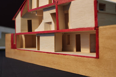
We had to reproduce plans and sections of the house, poché, as well as reconstruct the building as a sectional model. A thorough perceptual and conceptual understanding of the villa was expected to be gained through both these exercises, which could then allow a parti to be developed.
Through observing and learning from other members in my group my model making skills were drastically improved over the course of the project. I was encouraged by my tutor to become more expressive in my drawing which has allowed me to begin to develop my own style. Only through gradual understanding, and wide research was I able to develop my ideas the way I did, which I know will be helpful in future design projects.
‘Artifice’ therefore is the technical training of our hands and minds to manipulate the formal and spatial language of architecture.
TENSION / EMBRACEMENT
The Mother’s House by Robert Venturi is seen as a significant house as it is often claimed as being the first postmodernist building. However, Venturi disputes this as he sees himself as an extension of the Modernist’s ideas, attempting to combine function and liveability.
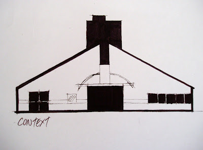
Venturi trained under Louis Kahn, who developed the notion of ‘program’ and ‘core’ spaces. This is evident in the house with the living room being the core space, and the secondary or program rooms feeding off it. As you approach the house your attention is drawn to the chimney with all the visual lines leading to this point. The chimney/stair amalgamation is at the centre of the core and is what encapsulates the entire idea of the house; that is the complex relationship of tension and embracement you create when you force contradictory parts together. As shown in the two longitudinal section poches, the stair and chimney are two elements which compete for central position; however they must share the space and as such must accommodate and adapt to each other the entire way through the house.
The relationship of tension and embracement became the concept behind my parti and poches, and I have attempted to represent this with two disparate parts clashing together and yet having to embrace each other to create a whole. I used the colour red to symbolise the emotion of the anger of the tension and also of embracement.
This concept is indicative of the many contradictions found within the design of the house, that of program/core, big/small, simple/complex, public/private zoning, interior/exterior, screens/enclosure, light/dark, additive/subtractive, symmetry/asymmetry and modern/classical. Venturi is demonstrating “Less is a bore” and includes all these paradoxes into one multifaceted house. However the concept is best demonstrated with the positive/negative stair and chimney relationship that is at the heart of the house.
What is particular about the complicated contradictions of the house is that they do not impede the functionality of the house but rather enable the users to function better within it. Thus by designing architecture which has a sense of emotion and elements which relate to one another, Venturi has created a building which is less mechanistic than the previous Modernists and one which is more suited to the human experience.
PARTI
Parti are derived from understandings that are non-architectural, often expressed by a diagram depicting the organisational floor plan and by implication, the sensual experience.
Diagrams can describe massing, spatial hierarchy, site relationship, core location, lighting conditions, entrance, interior circulation, public/private zoning, geometry, program, structure and enclosure.
It took me a long time to develop my parti, as I initially had many ideas I was trying to include. By conducting research into the house, the context and the architect I was able to finally simplify my concept and gain a clearer understanding of the house.
POCHE
“Architecture is the thoughtful making of space” – Louis Kahn.
Positive space has shape and negative space does not. However through the arrangement of positive spaces, negative space can be transformed to create a positive space.
We travel through negative spaces and dwell in positive spaces. Negative space promotes movement whilst positive spaces create place. Suburban buildings are typically freestanding objects in negative space.
We inhabit the interior spaces shaped by walls, roofs, floors, stairs and chimneys.
A floor plan demonstrates the organisational logic of a building (parti) where as a section showing the interior space embodies the emotional experience (poche).
MODEL
Subscribe to:
Comments (Atom)


