A dynamic urban art gallery that encourages the act of search and discovery to provide new ways of percieving space, structure and contemporary art.
Inspired by the local art scene and street culture of Newtown, I have developed a series of gallery and studio spaces that explore the role of ‘the wall’ in art. By designing architecture that plays an active role in the art experience I have attempted to create a gallery that encourages an active participation of both artists and the viewing public.
The building is designed to provide a studio space for invited local artists to work, and series of gallery spaces where they could later exhibit. The studio is located at the back on the ground floor. The rear of the site has a back entrance, ideal for the artists to come and go as they please. This rear courtyard is a public space where street art such as graffiti, poster advertisements and murals would be encouraged. For this reason the exterior wall is made up of swiveling panels, which could be opened to ‘bring the Newtown art scene into the building’ as inspiration for the artists as they work. It is also a unique way to display street art, temporarily "borrowing" it to put it up for discussion in a formal art setting and encourage people to think of street art as more than just vandalism and litter.
Whilst the artists are working on their projects the front façade of the gallery on King Street is closed off by a large hollow wall made of fiber cement cladding. All that is visible of the gallery is through the deeply set window, which if a passer by is not aware of could be mistaken for a bench or not even noticed at all. The idea is that the art making process is an inward focused venture, and the artists should not be distracted from their task. However, once complete the works can be moved downstairs or outside, and the front wall is shifted back to reveal a narrow opening. Accidental passers by and gallery seekers alike will then be able to pass through this gap and into an inner courtyard. Following on from Gordon Matta-Clark, who wanted to take art into the sewers, the patrons will descend down a set of stairs and then be guided along a large concrete wall to the gallery entrance. This transition is important as allows people a chance to catch breath from the business of King Street and prepare themselves for the art viewing. This descent is also important as it signifies a change in space and thought process. What the art patrons are about to view is not mainstream, and thus should not be on "main street". There is also something furtive and secretive about going below the cityscape, as if the challenge is to try and understand it from root level. As well, the entire entry course is to encourage the notion that art is an active discovery process, and the patrons are sharing this adventure with the artist.
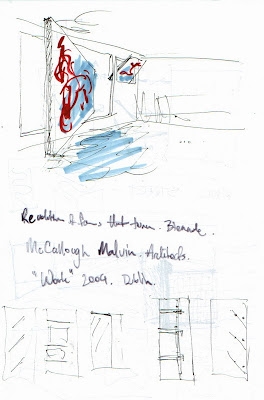
Inside, the main exhibition room is made up of a series of flexible spaces; intimate alcoves formed by the pipe, and large walls for murals with double height areas for installation works. Continuing my theme of an exploration of the use of the wall in art, there are a number of wall sections that can be removed from the western wall and used to form internal partitions. These wall sections can display hung artwork, or be used as platforms to stand work on. The recesses left behind can also be used to house work or be used as seating. If it is a large show, the exhibition can extend upstairs to the studio. From here patrons can exit into the back courtyard and leave via the alleyway to Eliza Street. Importantly, they once again have transition time to think and chat about what they just saw before being absorbed once again onto the bustle of King Street.
The residence on the first floor is located toward the rear of the site, away from the noise and lights of King Street, and receives optimal Northern sunlight. The space has two bedrooms, a spare in case the artist working late wants a place to rest and an outside private courtyard that has a good view over all areas of the site. The residence can be accessed either inside via the stairwell in the storage room or outside from King Street. Instead of pushing back the large wall when opening the building for an exhibition, a smaller section can be pushed allowing access to a hidden stairway set into the large concrete wall. This takes the owner up to the courtyard and into the residence without disturbing the working artists.
This design is concerned with making art an active discovery process that both the public and artists can share. The architecture is designed to play a dynamic role in the art, supporting and adding to the experience.


